
NSA Dashboard Concept
Design for Data Analysis
UX Research
Enterprise Design
Data Visualization
Team members
Bhavana Veeravalli
Katherine Ryan
Joshua Garrett
Client
The Laboratory of
Analytical Sciences
Role
Research, UX, and Product Design
Project Overview
In this NSA-sponsored project, we partnered with the Laboratory of Analytical Sciences to reduce cognitive overload for U.S. Intelligence Community data analysts and improve qualitative report creation for senior policymakers. Our goal was to build a dashboard that maximizes the efficiency of a senior policy analyst's daily routine by focusing on the intuitiveness and hierarchy of information.
Year
2023 (7 weeks)
Problem Statement
How does a digital search and contextualization tool aid the Intelligence Community (IC) data analyst team leader in gathering and prioritizing global information for creating a contextualized report for domestic policymakers?
Needs
-
Consolidated search with intuitive filters and consequential prompts.
-
Tools for detecting data patterns.
-
Ability to quickly make reports that highlight needed policy changes.
Fears
-
Mismanagement of the team and missing critical report deadlines.
-
Reporting on inaccurate data.
-
Failing to communicate valuable action insights for policy makers.
Features
-
Built-in AI or ML-powered analytics.
-
Streamlined process for formatting. and submitting accurate reports
-
Simplification of data and time spent looking for data anomalies.

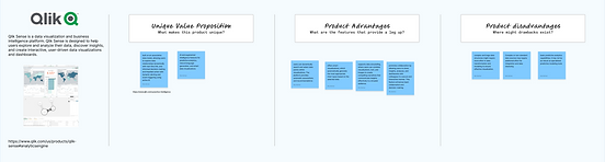

Market Research
Due to security clearance, LAS couldn't share their precedents, so we researched industry-standard data analytics software to identify feature opportunities. We found the need for:
-
Simplified visual design.
-
Enhanced management tools.
-
AI-driven automation features.
LAS Interviews
After defining our problem statement, we
sent interview questions to LAS data analysts
to clarify our persona's responsibilities.
Key Takeaways:
-
Streamlining task switching and team management to reduce cognitive load.
-
Enhanced tools to aggregate inputs
-
from team members into a unified report.
-
Data and report verification.


Christian: Senior Policy Analyst
About
Christian is a Team Lead for the Oceania analysis team. His daily work deals with understanding key figures and interests in Oceanian international policy. To stay abreast of their information space, Christian and his team use a wide range of tools to help sift through relevant sources.
Christian needs the tool to help drive his analysis experience by providing context and prioritization for the information being returned in his query results.
Pain Points
-
"I find it stressful to organize my team's finding into a clean and comprehensive report by each weekly deadline"
-
"I often can't track back to the original source of information"
Goals
-
"As an international Policy Analyst, I want to synthesize and interpret my team's findings into reports so that I can accurately inform policy makers and help my community"
Actors


User Journey
Goals
Phases
Pains
Steps
Actors

Task Breakdown
Through our interviews and user journey mapping, we identified five key tasks that Christian manages throughout his day.
Team Assignment
Christian assigns research questions or analysis goals
to each team member.
Team members focus on their assigned tasks and analyzing large datasets.
Data Analysis
Team Submissions
After analysis, team members submit data, insights, and conclusions to Christian.
Further Analysis
Christian further analyzes submissions, integrates insights, and identifies patterns.
Report Generation
Christian generates reports with policy recommendations based on the team's insights.
Proposed Task Analysis
Legend:
Decisions
Main Actions
Secondary Actions
Application Features

Product Translation
After mapping out Christian's daily tasks, we broke the dashboard into five pages that would be needed to compete his daily goals.


Inbox
Team
Initiatives
Centralized communicate so Christian can organize his upcoming responsibilities.

Team assignments and tracking so Christian can monitor project progress.

Organization of overarching research tasks and who has assigned tasks under each.
Queries
Efficient query repository with saved areas of interest and initial data tracking.
Reports
Efficient organization of findings so Christian can quickly compose the reports.
Quick Wireframe Sketches
We recognized that creating a dashboard of this complexity would be a significant challenge, so we began with quick sketches to get our ideas flowing.


Low Fidelity Mockups
After talking through our initial ideas, we moved on to lo-fi mockups to get a better idea of the efficiency of the user flow and the hierarchy.


Internal Usability Testing
After our initial low-fidelity iterations, we conducted internal usability testing to evaluate the intuitiveness of our dashboards. Completing tasks such as creating a new initiative and submitting a report. We recorded their pain points and suggestions for improvement.
-
Clearer Flow: Build a smoother connection between initiatives, queries, and reports.
-
Simplified Buttons: Group functionalities logically on their respective pages.
-
Toolbar Placement: Relocate the toolbar to a more intuitive position.
-
Hierarchy: Establish a system, so each page isn't as overwhelming
External Usability Testing
After implementing changes, we made a Figma flow for LAS analysts to review.
Feedback:
-
Clarify the nodes section in initiative page.
-
Improve navigation on the queries page.
Overall, it gave us the confidence to move on
to high fidelity mockups and finalizing the flow.

Inbox Triage
The Inbox page operates like a traditional email inbox but integrates AI to highlight crucial information and streamline initiative creation.
It includes a Daily Journal and
AI-Assisted Recommendations
to help Christian pick up where
he left off the day prior.
Manage Team
On the Teams page, Christian
can view team members and
their assigned initiatives. He can access tasks, create new tasks, monitor user activity, and message with analysts.
Enabling him to effectively manage the team while he analyzes data and write reports.
Data Queries
This hub consolidates data analysts' findings, enabling Christian to save notes and visualizations for reference
while preparing the final report.
Here, Christian can view all data collected under each initiative, preview findings, analyze, and create data visualizations.
Initiative Tracking
Christian can edit and create new initiatives, adding goals and contributors. He can customize initiatives with a task kanban, Gantt chart, and timeline, etc.
The nodes view tracks data from queries, enabling easy reference to original sources.
Report Creation
The reports page I designed centralizes information, enabling Christian to design from templates.
It includes drag-and-drop notes,
AI suggestions, info validation, an archive of past reports, and saved data visualizations to streamline policy report creation.
Chat and Notes
The dashboard includes chat and notes pop-up screens accessible from any page, at the bottom of the navigation sidebar.
Christian can quickly chat with his team and record notes under each initiative, ensuring his thoughts are saved for future reference during report creation.


Final Thoughts
This project provided valuable insights into designing user-centered solutions for complex roles. Our research and usability testing highlighted the importance of streamlining task-switching and simplifying data management to reduce cognitive load for users like Christian. Through iterative design, we refined the dashboard’s flow, organized functionalities more intuitively, and created a clearer hierarchy to support efficient navigation and reduce overwhelm. Presenting our work to NSA members was a rewarding experience, reinforcing the impact that thoughtfully integrated AI can have in applications. Moving forward, I am excited to build on these insights, exploring further AI enhancements grounded in real-world user needs.